Make a minimal room through visible decisions rather than emptiness
Minimal is often used to describe a room with little visible activity, but an empty image does not show whether the space works. This contemporary exercise focuses on clear forms, deliberate gaps and useful objects. The aim is an understandable room that supports its occupants, not a moral score based on how few things they own.
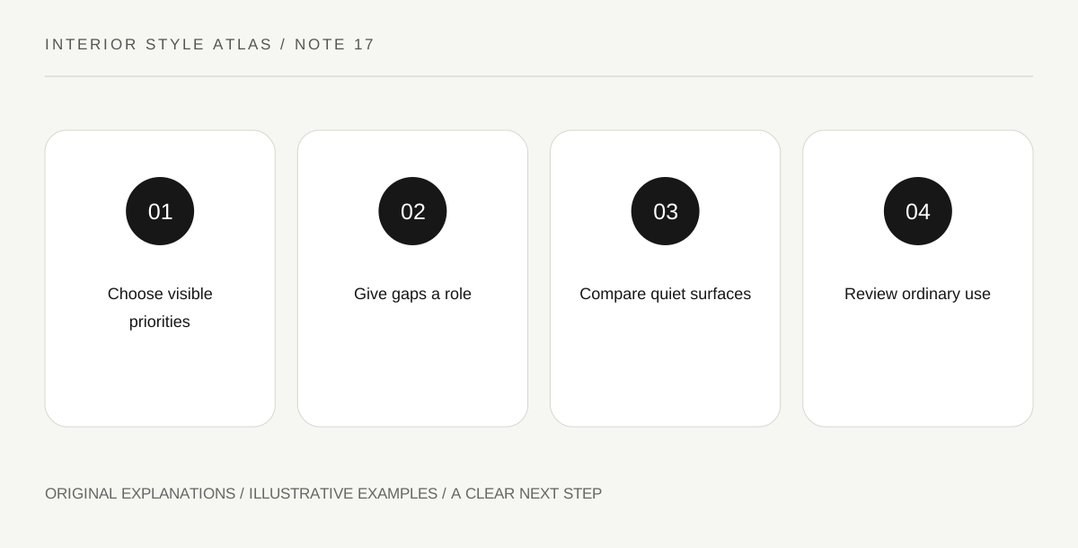
Original explanatory diagram. Read the full method and limitations below.
Decide what should remain visible
List the objects needed for the room’s actual activities, along with the personal things you want to see. A minimal appearance does not require hiding every sign of life. Choose a few visible priorities so you know what the quieter background is intended to support.
Distinguish reducing visual competition from discarding possessions. An object can move to another appropriate place without becoming worthless. Likewise, a meaningful collection can remain visible if it is central to how you enjoy the room. The exercise is about attention rather than a universal possession limit.
Use gaps as designed space
The area around an object affects how clearly its shape reads. A gap between groups can make each more legible. That does not mean every surface must be bare; it means empty areas have a role in the composition rather than appearing only by accident.
Choose one surface and arrange its necessary items into a clear group, leaving a usable area. Look from the positions where you actually see it. A beautiful gap in a doorway photograph may disappear from a seated angle, so compare more than one view before making a conclusion.
Notice small differences in quiet surfaces
When fewer patterns compete, texture, edge and colour value can become more noticeable. A matte surface and a smooth reflective one may provide enough contrast without a bright accent. Describe those relationships specifically rather than assume minimal must mean white.
Keep materials and care needs accurate. A quiet-looking finish may be delicate, and an apparently simple object can have complicated maintenance. Choose what fits your life rather than make daily use difficult for the sake of a sparse image. Visual simplicity does not automatically equal practical simplicity.
Test the room during ordinary use
Carry out the activity the room supports: reading, conversation or work. Notice where necessary items accumulate and whether the arrangement provides a convenient place for them. A minimal room that works only before use needs another design decision, not more discipline from its occupants.
For an exercise, keep one clear form, one personal object and the necessary task items visible. Review the arrangement after an ordinary day. Adjust the relationships that fail rather than impose a fixed empty-surface rule. The successful result is clear and livable for the people who use it.
Illustrative minimal reading area
A reader keeps a chair, light, side surface and a framed photograph. The table has space for a book and cup rather than being permanently empty. A textured throw supplies a quiet contrast. After use, the book has a natural place to remain. The area looks restrained because decisions are clear, not because the reader must erase every sign of activity.
Practical checks
Optional checkboxes save only in this browser.
Questions that come up
Must minimal rooms be white?
No. Colour, value and texture can be organized quietly in many palettes. Choose clear relationships rather than treat white paint as the definition.
Does owning fewer objects make a room better?
Not universally. Suitability depends on use, preference and circumstances. This exercise reduces competing visual decisions without assigning moral value to a person’s belongings.
References and scope
These sources support the factual background. Examples and exercises are original illustrative teaching material. References do not imply endorsement.
- Getty Museum: Principles of design — Balance, emphasis, repetition, proportion and visual rhythm in original room exercises.
- Getty Museum: Elements of art — Line, form, colour value, space and texture.
- V&A: Furniture collection — Furniture as diverse objects with construction, material and historical context.